There’s real power behind paint.
And the colour you choose for the rooms in your home can make or break them.
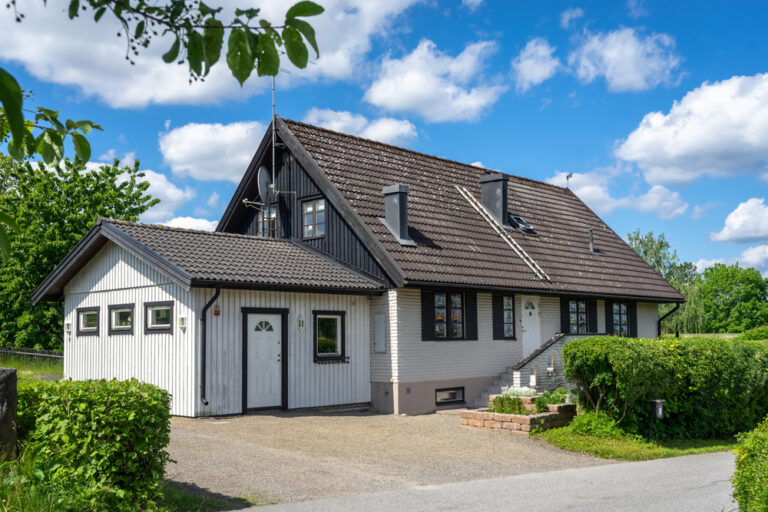
For those buying property, you’ll want to put your own stamp on your new home with a colour that represents you.
And for landlords, choosing a wall colour is as much about practicality as it is appealing to potential tenants.
But with so many colour options to choose from, where do you start?
This guide highlights everything you need to consider before picking a paint colour…
How can paint transform a room?
Paint has the potential to bring a room to life – or drag it down.
The right colour on a wall can:
- Make a room feel light and airy
- Increase the feeling of space in a small room
- Create a warm and cosy feel
- Enhance your mood
- Add pattern and texture to your room
- Create contrast and spark interest
How do I choose the right colour for my room?
With so many colours to choose from, picking the right one for your room can be tricky.
Here are the main things you’ll need to consider when choosing a wall colour…
1. How big is your room?
The size of your room is probably the biggest factor when choosing the right paint colour for your walls.
Small rooms can feel cramped and dark wall colours only enhance the feeling of a lack of space.
If your room is small, a lighter colour and even an off-white can make the walls feel further away – boosting the feeling of space.
If the room gets plenty of natural light, whites and pale shades will reflect that light, which can also make the room feel bigger than it actually is.
And most importantly, avoid feature wall colours and contrasts in small rooms – sticking to one colour throughout will make the flow of the room appear seamless.
2. Which way does the room face?
Light is a hugely important factor when choosing a wall colour.
And which way your room faces can impact on the amount of natural light it receives.
North-facing rooms
If your room faces north, it will feel cooler, so avoid colder colours like blue and grey.
Yellows and pastel pinks can work well in a north-facing room, while natural shades like chocolate or coffee can also help make the room feel warmer.
East and west facing rooms
Rooms facing east get the bulk of their light in the mornings, so choosing a colour for these rooms is all about balance and what the room is used for.
An east-facing bedroom, for example, will have bright light early in the morning, so pale blues and greens can help make that light less intense first thing.
In an easterly-facing living room, however, you may want to embrace the light of the morning, while making the room feel darker and cosier later in the day.
For that, a deep blue or dark grey can work superbly.
These colours can work equally well in a west-facing room, which will receive most light in the afternoon and evenings.
South-facing rooms
If your room faces south, it will get strong sunshine all day.
So, cool colours like pale blues and off-whites can help reduce the intensity of any heat and keep the room feeling light and airy.
If you are set on a deeper, rich colour for your south-facing room, try to select one that’s a tone or two lighter than your ideal shade.
3. What time of day are you in the room?
Again, light is key here – but artificial light as well as natural light.
If you spend most of your time in a certain room after the sun has gone down, you’ll need to think about how the room looks when illuminated by artificial light.
Electric lighting has developed hugely in recent years, so look at the number of Kelvins or Ks when buying bulbs.
The higher the Kelvins, the cooler the light, so avoid high Kelvin bulbs for rooms with pale blues and generally colder colours.
On the contrary, if you’re spending time in a room during the day, perhaps an office, you won’t want to feel blinded by lots of natural light rebounding off light walls.
So, consider a deeper, darker colour to cool the intensity of the sun – saving lighter shades for rooms with much less natural light.
Which colour paint is best for bedrooms?
Bedrooms should be havens of tranquillity, so think about calming, natural shades for your walls.
Pale neutral colours can also help make your bedroom feel more ‘roomy’, while greys remain on trend for bedrooms and can help to create a sophisticated, relaxing ambiance.
Greens can also work well in bedrooms, bringing a botanical feel to your space.
Light blues, meanwhile, can work well in bedrooms with lots of natural light, helping to cool down the room in the warmer months.
Amazing kitchen wall colour ideas
The colour of your kitchen walls will largely depend on the units you have.
White gloss units paired with white walls can create a seamless, minimalist style, especially when paired with light wooden flooring.
The kitchen is a real statement room, however, so creating some contrast can also work brilliantly. Light units paired against deep and rich blue walls can look stunning, while darker cabinetry really stands out against crisp, pale walls.
Modern kitchens are the heart of the home and sociable spaces, too, so if in doubt, opt for a warm tone of yellow.
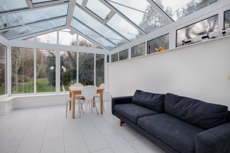
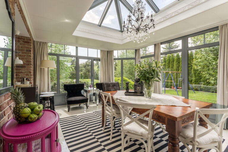
Living room colours to lift your space
Living rooms are all about creating drama and contrast.
So, rich blue walls as a backdrop for yellow furnishings and dark, natural flooring will always work well.
If you’re not feeling brave enough to go bold with a deep blue, oceanic tones can also work well against dark wood flooring.
And if you’re looking for an option with real longevity, neutral greys are showing no signs of going off-trend any time soon.
Colours to lift your mood… and ones to avoid
Colour can have a huge psychological effect and goes a long way to determining our moods and feelings.
“When you decide whether or not you like a colour, that’s an emotional experience,” says behavioural colour psychologist Karen Haller.
“First look at the purpose and the positive behaviours you want to create in that room. Then choose the colours that you instinctively feel will create these behaviours.”
1. Bedrooms – avoid yellow and stick with green
According to psychologists, yellows can affect the nervous system and certain shades are heavily linked to emotional state.
So, avoid yellows in bedrooms and instead opt for soft greens which can help with restful sleep.
2. Living rooms – go for natural colours
Natural materials like wood can help to relax the mind, so these tones work especially well in living rooms or other reception rooms.
3. The office – opt for dark, rich blues
Lots of light can over-stimulate and cause distraction or procrastination, so if your office space is naturally light, opt for a deep blue which is more soothing.
4. The kitchen – be bold with orange
Kitchens are hubs of the home and often social spaces to enjoy with family and friends.
So, try a shade of orange, which can help stimulate conversation, or minimalist white which is the least distracting colour of all.